
 Tweet
Tweet
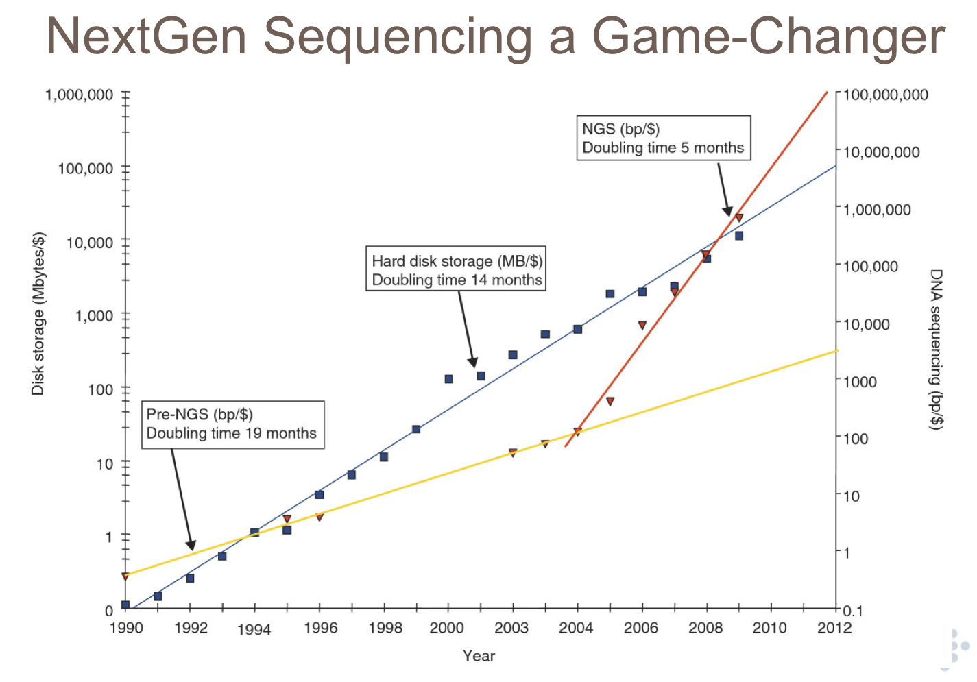
I'm preparing a talk on bioinformatics for a group of physicists. I want to show them that the main drive for bioinformatics development is enormous data growth in the recent decade or so. NGS would be a very good example of this. I managed to find a few plots on the web, but most of them are Excel graphs in linear scale, for example this:

I think Sanger's cumulative yield would be a very good example. Can anyone provide me with (up-to-date) data for such a graph: number of bases sequenced as a function of time? It would be great to have both traditional sequencing and NGS, to show a quantitative change in data growth. I would make a nice logarithmic graph myself.
I think Sanger's cumulative yield would be a very good example. Can anyone provide me with (up-to-date) data for such a graph: number of bases sequenced as a function of time? It would be great to have both traditional sequencing and NGS, to show a quantitative change in data growth. I would make a nice logarithmic graph myself.


Comment